Missing features & functionalities

New Feature Request:
#72 Upgrade All button to upgrade all creatures (both in garrison and visiting hero) that can be currently upgraded in the town. This is similar to Buy All and there’s a WoG script that does it by shift-clicking the button (although I think this script may not have been distributed publicly).

Re: #69 (Buy All Button) - There was also an addition to WoG’s Buy All that lets you choose the order that they’re bought in (I think ctrl-clicking the button brings up some dialogs to select the order). Again, this probably wasn’t in the public WoG distribution.

Is there any list of artifacts that have and haven’t been implemented similar to the one for adventure map objects? It would be helpful.

Yes, on the same page.

If you are referring to the Google docs link (ITEM IMPLEMENTATION STATUS in my signature), then check the other tabs at the bottom. :wink:

And let’s hope in one of the future versions of Google docs, they’ll enhance those bottom tabs to allow users to emphasize them somehow, because I also didn’t notice them the first time (if you’re not used with the application, they’re not at all obvious).

[size=75]@Warmonger: a tiny piece of advice (and I hope you don’t mind) - when you answer in “riddles”, add a smiley. :slight_smile: Sometimes same words can be taken as friendly or rude by different people. Here was okay as we know each other a bit, but in the “offical VCMI thread” at Celestial Heavens (a similar issue with a link) they kinda interpreted it as sth else. And in such cases a smiley often helps… :wink: [/size]

Ah yes, exactly what I was looking for. Spells, too.

Implemented.
(now only usual battle and taking over but work on sieges should soon be started).

Implemented.

Implemented.

Implemented.

Implemented.

73. How about centering window after launch? This 1280 x 960 pops up beyond edge of the screen.

[Fixed …if I understand correctly the report > at least I don’t see popups beyond the edge anymore]

^ I almost thought of reporting that in a bug thread, as it’s valid for all high resolutions: the client opens in different areas of the screen, sometimes though too low, so that parts of the interface are not visible until we manually move the screen. Though this is really not a priority, so it can stay in this thread as well. :wink:


74. (NEW) Links to and support for all H3 campaigns within 1 interface.

With the Main Menu being reworked now (and perhaps adjusted to higher resolutions in the future), it should be possible to have more campaign links on one screen. In H3Complete we had SoD, RoE & AB on one screen. But with Custom & Exit the screen was full. WoG had to replace SoD to get its link on that page.

It would be nice if the reworked H3 Main Menu would allow access to all H3 Campaigns installed in our H3 directory: For x600 resolutions, we could have the RoE, AB, SoD links, but perhaps the Custom link could be replaced by “More”, which would take us to a new screen with selection between: Heroes Chronicles, WoG, (HotA - if the case) and Custom. For higher resolutions, some of the links could be integrated in the first Campaign screen already. An alternative would be to have the menu links scrollable somehow, or else reduce the size of the icons (though, with the new high resolutions, reduced icons might become too small).

Perhaps the most difficult would be to integrate the Chronicles links, but in the end it would be nice if we’d have access to all campaigns ever created for H3, withing the same interface. :wink:

75. (NEW) Support for all H3 menu backgrounds.

It would be great if VCMI could support all those menu backgrounds. And perhaps somewhere in the VCMI options we should be able to select things like “Play with Armageddon Blade theme”, or “Use H3 background themes at random”.

For reference, here’s a link with all the screens - h3.heroes.net.pl/pliki.htm - though probably you know the site already. :wink:


76. When we go with the mouse cursor to the edge of the client interface, the map scrolls, but also the mouse pointer should change from the default arrow, to an arrow pointing in the direction of the scroll.
E.g.: default arrow http://i4.photobucket.com/albums/y104/Zamolxis/VCMI%202009/2009-09-05_DefaultArrow.jpg vs scroll left http://i4.photobucket.com/albums/y104/Zamolxis/VCMI%202009/2009-09-05_ScrollArrow.jpg vs diagonal scroll http://i4.photobucket.com/albums/y104/Zamolxis/VCMI%202009/2009-09-05_DiagonalScroll.jpg

77. (NEW) Enhanced map scrolling speed.

Now we have only 1 speed for map scrolling, when our mouse pointer is anywhere within 5mm (I think) from any map edge. The speed is pretty reasonable in general, however it’s a tiny bit annoying when you want scroll just a little bit for an exact focus. It always goes too far and I have to go back & forth a few times to get that focus.
:exclamation: Perhaps we could have 2 scrolling speeds: a slow scroll if the mouse pointer is (3-)4-5 mm from the edge, and the normal scroll only when the mouse pointer is within (2-)3 mm from the edge.

Implemented by Tow Dragon.

Implemented.

Implemented :slight_smile:

Implemented.

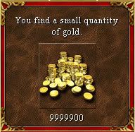
78. (NEW) Enhanced message for resource piles found on the map, depending on their size.

[size=92]This is just a minor suggestion and open for debate, as I’m not sure if it’s worth the coding effort, but I thought of mentioning it nevertheless.

When we pick up a resource pile, we have the same message, regardless of the size of the pile:[/size]

Now, that’s definitely not a “small” quantity. Shouldn’t we have the size attribute change to “big” or “large” above a certain value (i.e.: 5,000 for gold and 50 for the other resources)? IMO small quantities are only those within the range of the randomly generated values, or maybe a bit more, but just up to some limit.

Also, or even especially after launching new map.

Some more low/medium priority missing features:

79. There should be a glow effect around the structures built in town. I can’t quite tell with my eye the exact sequence of colors in the glow animation (sth like white, to flashy yellow, to white again, and then a pale yellow fading away - but I’m not sure), so hopefully it’s a standard animation that you can identify. Or else someone with a better eye (or means to slow it down) could check and confirm.
[IMPLEMENTED]
The animated glow usually surrounds the upgraded building, while other structures created on the side just fade in, without being surrounded by the glow frame (i.e.: Citadel glows, while Moat only fades in during Citadel’s glow animation; same for the Rampart extra huts which fade in while building the Town Hall).
[TBC]

79.1. Shipyard also gets the glow animation when we build a ship (which fades in). However, H3 had a minor bug with this animation, which would be better if we can avoid in VCMI: the shipyard glow frame was overlapping the boat. This is best noticeable at Necropolis & Fortress. The boat fades in placed as such, that a piece of the dock will be behind it. But the glow animation is shown on top of the boat, which looks quite strange if you pay attention to it (the dock’s glow frame in front of the ship, which is actually in front of that piece of dock).
[To be checked after [url=http://bugs.vcmi.eu/view.php?id=1306]#1306 & #1307 are fixed]

80. L-click in the InfoBox should cycle between:

  • Kingdom Info (temporary)
  • New Day animation (temporary)
  • Selected hero/town info (default)
    [IMPLEMENTED]

80.1. R-click in the InfoBox should open the window describing its functionality.
[IMPLEMENTED]

81. An option to keep defs unpacked all the time (especially for adventure map objects which may get high in numbers with new resolutions).

Here’s why I even bother about it:

Actually almost all defs are kept unpacked (except creature animations in battles - they are too big).

Many, many thanks for all the new features implemented! Especially for those quoted above - they’re saving me from a lot of redundant actions. :slight_smile:


[size=75]And a not-so-urgent request :)[/size]

82. Possibility to change Music & Effects volume during battles.


And a question: Are the town graphics limited to what we see in the town screens, or are they by any chance actually extended, but covered by the bottom panel? I’m asking this because I noticed the town screen resource bar becomes actually redundant in resolutions above x600. And I was thinking of the possibilities of putting that available space to good use in the future… but it depends on the possibilities. :wink:

EDIT - While waiting for the answer on the above, I’m already going to post the suggestion(s) I had in mind here:

  1. (NEW) Analyze if the resource bar in Town screen is indeed redundant on high resolutions; and if so, see if we can make better use of that space:
    a) If NWC had extended town graphics, which now have their lower part covered by the panel, then it may be interesting to reveal some of them by removing the resource bar (chances are little though I suspect)
    b) The resource boxes may be replaced by some buttons that may come in useful when in town screen, like Save/Load, Kingdom Overview, End Turn, etc. (see also suggestion #84 below)
    c) Simply remove the resource bar, and by shrinking the Town screen, we would see more of the map behind

[size=75]This is a low priority suggestion for the far feature which I’m logging to make sure I don’t forget about it by next year, where such enhancements may be perhaps considered. :stuck_out_tongue: :)[/size]

[size=75]Another feature suggestion (everything except 84.1. being low priority - though even 84.1. can be ignored if the whole thing is actually difficult to implement):[/size]

84. (NEW) Possibility to access Adv.Map side panel buttons while in Town screen, for high resolutions (or alternatively, perhaps enable their hotkeys to be recognized within Town screen).

Looking at the evolution of screen sizes, in a couple of years, when VCMI will be a ‘mature’ project, embraced by many H3 fans, I guess most of them will play the game in high resolutions looking like the screen below, where the Town screen will be just a “small” window in the middle of the Adventure Map:

i4.photobucket.com/albums/y104/Zamolxis/VCMI/VCMI%2007/th_2009-09-22_ThinkOfUsingSideButtons.jpg

With the Adventure Map buttons becoming visible next to the Town screen window, the temptation of being able to use them may come along. I’m not sure if allowing access to all of them would be useful, so I’m gonna list them below in the order of their added value (IMO):

HIGH:

84.1. End Turn. Perhaps not as useful in the final game as the next one, however for testing purposes this may come very much in handy at this stage. For example if we would like to test the town build-ups in 1 fast go through all the towns. It would take half the effort to cycle only between ‘build’ & ‘end turn’ commands, rather than adding also the ‘exit town’ & ‘enter town’ to the sequence of actions to be done every turn until the town is fully built. Eventually it may also prove useful in the final game (i.e.: build structure at EOD & pass turn to get the money to recruit the new creatures in the beginning of the next day)

84.2. System Options. Especially in the final game, it would be great if we could have access to Save also while in town screen. And also the other options (Load, Restart, Quit, Music Volume etc) would be a nice to have.

MEDIUM:

84.3. Kingdom Overview. May come in handy to check it w/o exiting the town screen, in case for example you need info on your income, in order to take some decisions regarding the next structures to be built.

84.4. Quest Log. Useful in case your quest is accumulating a certain number of creatures or resources, which again may request some strategic decisions in the town screen.

LOW:

84[size=84].5-10.[/size] All others. I can think of little to no use in implementing the rest. However, as said above, I also don’t see a problem with any of them (except for the time it may take the devs, if the case). So supporting the rest of the buttons would be fancy at best, nothing else. If I think of a relevant use for any of the buttons not mentioned above, I’ll edit this post later on. :wink:

Zamolxis, Great idea. It’s so obvious but no one before noticed that. I will only add 85. (NEW)] the possibility to move the town screen and 86. (NEW)] be able to open more then one town screen in the same time.


*[size=75]I added log numbers to your new suggestions. I also thought the possibility to move around the town screen may be a cool one, especially if we could play the adventure map behind it. Opening more than one town screen at a time sounds interesting (especially on very high resolutions, where we could put 2 next to each other), but I fear it will require quite a coding effort.

Zamolxis.[/size]*

Right now (VCMI 0.73c), we can start a map with multiple Capitols if set so from the MapEditor. And moreover, if we conquer an enemy town with Capitol, we can keep that one as well. Both of these behaviors could be kept as a modded feature (if enabled from the VCMI options), but I believe the basic game should keep the “1 Capitol per player” rule.

LE: After testing in H3C & WoG I was surprised to discover that H3 actually allowed more than 1 Capitol per player if built from Map Editor. It’s not sure if it was an intended feature, but nevertheless, that means we definitely have to keep this possibility, at least as a selectable option.

However, I think there is room to enhance a bit the gameplay, w/o having to alter the “1 Capitol per player” rule:

87. (NEW) In H3 the Capitol of a conquered town just disappears (if we have one already). Perhaps it may be interesting to actually get a message after conquering the town:

If we already have a Capitol: “While conquering your enemy’s town, you destroyed their Capitol.” (or more customized - “While conquering [town name], you destroyed [player color]'s Capitol”)
If we don’t have a Capitol: “By conquering your enemy’s town, you also gained control of their Capitol” or “By conquering [town name], your kingdom now gained a Capitol”

88. (NEW) A step further from the above, would be the open possibility to switch Capitols when we already have one and conquer another (it would represent minimal modding, but as it respects the 1 Capitol rule, perhaps it’s acceptable in the basic game). So I am talking about a choice message window after the battle: “While defeating [town name], you discover it contained your enemy’s Capitol. Would you like to destroy their Capitol or move your kingdom’s Capitol in the conquered town?”

The added value of implementing this, would be creating the possibility of better strategic decisions, for example in case the conquered town is placed in a location where we can provide better defenses as compared to the original Capitol town.

89. (NEW) And related to the above, for the same strategic purposes, it may be interesting if we would be able to dismantle a Capitol, in order to build it in another one of our towns.

I understand that this last suggestion starts to sound like WoG, but as long as we’re talking only about the Capitol, perhaps it’s acceptable. Otherwise we can just keep it in mind for when we’ll start working on VCMI mods. :wink: