I hope it will be an option in VCMI kind of WoG Option, not hardcoded in VCMI basic version=OH3?
Ofc I’m not saying, I don’t like it, but I’m not sure if it is good solution.
I hope it will be an option in VCMI kind of WoG Option, not hardcoded in VCMI basic version=OH3?
Ofc I’m not saying, I don’t like it, but I’m not sure if it is good solution.
A few suggestions regarding creature window:
img27.imageshack.us/img27/8906/creaturewindowsuggestio.th.png
Uploaded with ImageShack.us
I vote for making it optional too, I’m not sure if everybody will like it.
Extract this package to your data folder - it contains stack skill icons required for new interface. Inactive skills are unused now though.
StackSkills.rar (986 KB)
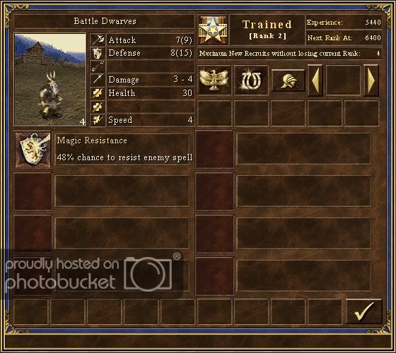
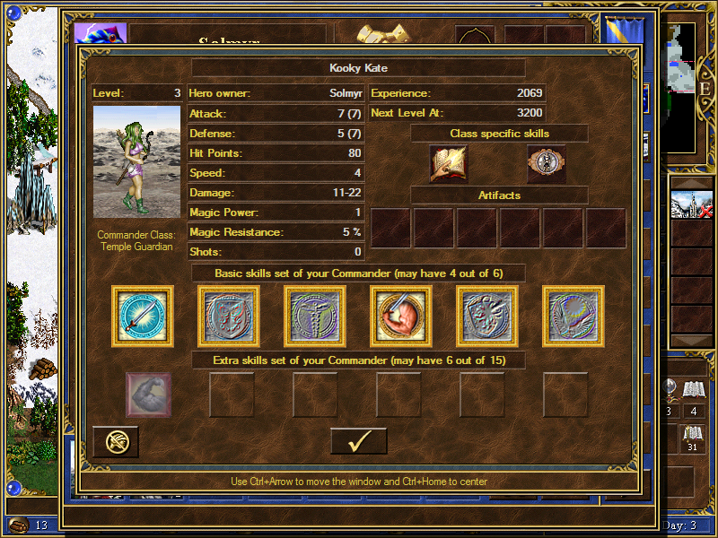
I believe it’s time to start developing Commanders soon. However, there’s a question with their interface - originally they had two windows in WoG:
Detailed info on hero screen
In battle pop-up.
The second one can be definitelly replaced with new creature window:
http://forum.vcmi.eu/album_pic.php?pic_id=42
It contains info about abilities, level, spells and even artifact(s?).
However, maybe it could replace also first window, the big one?
The only issue are commander primary skills (attack, defense, speed, magic resistance, health and damage) - there is no good place for them. I believe it may be possible to place them the same way as abilities - in small windows with description. This, however requires skill icons to resize - either in program (with new resource management system maybe?) or by hand and add the resized icons to package.
The second option I consider is to make a variant of this window which includes horizontal place for secondary skills in between main creature info and special abilities. What do you think about it?
Do you have any other proposals?
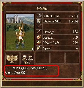
Also, there’s another suggestion. As you may have noticed, there is one free space in to-right corner of creature window. I would like to place a casts counter in there - as every casting creature has a number of casts at their disposal, including the creatures with rebirth. In WoG, these can be modified. Commanders also use their casts and it’s easy to forget how many of them were already used.
I only wonder how to make it visually appealing - a single unnamed number in a window may be quite confusing.
@about cast count
i propose some universal spell icon (or even the current spell icon) with the number of casts on top of it. the number will be big and bold (if we assume that number of casts <= 99 we can make it square and make two digits almost totally fill the box)
@commander big window
we can make own. it will be good to be able to see all skills of commander (it can have more than fits into oryginal in WOG)
Thanks to courtesy of Fishkebab we now have improved creature window, new Commander windows and icons for missing creature abiities. They will now be needed to display upcoming content correctly.
This package also includes new quest dialog from Ivan.
Data.rar (957 KB)
May we use some pictures to replace commander icons in WoG?
I remind much info on commanders and stack experience is in text files in lods, including descriptions. There also some hardcoded text/int tables in exe file on every feature (for example building exact positins are in simple table in exe file on known position so it would ease town feature if said early enough).
Uhm, which, where, what do you want to do?
Yeah of course less hardcoded is better if applicable but I meant these settings could be ripped from simple integer table instead searching proper values for each one (you did a tool specifically for it while it could be just copy-pasted).
Once you don’t refer code but only data direct ripping is nothing bad (of course you are free to make it more readable format). I suggest talking with guys from ERA if you believe there’s some table and you prefer not to recover it step by step.
Also knowing adresses of such data you could make UN:C codes reffering to it be proxied to actual ingame data structure which be even more easy if you organise the data almost same way in memory (the format of new config files doesn’t matter once result of parsing is enough similair).
Once you proxy most of data tables you would be compatible with most of the scripts not considered to be portable which is fair achievment (but still it is sometimes easier to port the script - accent on sometimes).
No direct memory access in scripts. Never.
End of offtopic.
I just wanted for mention two things
(2) was indeed offtopic, sorry, but more important to say was (1) and that Reverse Engineers from ERA could find the info for you so you won’t need to guesstimate the values searched, because you would instantly get exact ones - for example you wouldn’t need use (and probably write) tool “wpasowywacz”, because all data it collected was actually in table in h3wog.exe/Heroes3.exe which could be just read from there - so next time just ask people at ERA/WoG if they can find info for you which would be easier. All descriptions of stack experience features already are in text file but oddly sorted and I seen you recreated some of it for config file for bonus handler - which I answered mostly to and the connecting thing is stack experience mechanism.
I’ll try next time be more ontopic and do not do too much tangents.
I just learned that commander windows are in 32-bit format, which is still not correctly handled by recoloring function.
So here’s fixed archive with new commander button.
CreatureWindow.rar (740 KB)
@Warmonger / Fishkebab: was it GiMP or Photoshop used for the creature/commander windows? If GiMP, could I have the .xcf files used, which still have all the layers & objects separable within? I want to try some adjustments and it would save me a great deal of time.
Also, can anyone confirm which fonts VCMI/H3 is using? Looks like Times New Roman, but if I use it in GiMP it looks quite ugly as compared to the game.
[size=67]Intro (you can skip): Back in February 2011, I wanted to start working on the Extended Creature Card, but didn’t manage in the end. The past year and a half I didn’t have much time for VCMI (moved house, endless renovations, long periods without internet or even electricity, so computer was often resting in box). So I had to prioritize bug hunting for each release the few times I had time for it. Meanwhile I see Warmonger had to step in and do the job. I feel a bit bad, as with his coding skills he could have focused on other elements while I could have done this. But now I finally have some time, and I’d like to help polishing the Creature & Commander Cards.[/size]
I’m posting the below because I think the Creature & Commander Cards could benefit from some extra polishing, and I had some time to work on some proposals. The items that drove me to this were:
[size=92]- Check button: TMK, in ALL H3+WoG interfaces, this button is always at the bottom, mostly bottom-right, rarely bottom-center. The new position is then not intuitive at all. I’ve been playing VCMI for more than 10 hours the past week, and my mouse still goes to the wrong side of the window to close it. Not only because 10 hrs of VCMI couldn’t erase in my brain 10 years of H3/WoG, but also because all other interfaces in-game continue to have the Check button at the bottom.
Please have a look at the below and let me know your thoughts/preferences:
[size=67]- ignore the size (used CreWin4, I know it’s smaller if less skills)
Suggestion 1

Suggestion 2

Suggestion 3

In Battle
I do agree that the current 560x-size windows may look too wide, covering most of the battlefield each time we R-click a creature. I could easily restrict it to 70-75% of current width as you suggest. The downside is that we won’t have a great overview of the Secondary Skills for creatures having lots of them. I know they aren’t that many, but who knows what future mods will bring. Maybe I’ll draft a 4th suggestion and post it later. But first I want to gather some initial feedback on the above as starting point.
I also vote for making the Extended Creature Card optional, at least for the main (1.0) release. It’s better as a ‘cool option’ to discover later on, than surprising the player with a mega Creature Card covering all battlefield in the default release, which some might find annoying and complain about. The new option is System Options may not the most intuitive place they would go to look (they’d rather get lost looking for a WoG Options-like button somewhere, or not even have the patience for that, and start “Bring old Creature Card” forum topics or Mantis reports). 
.PCX file attached - ready for Suggestions 1 & 2. If I see a preference for #3 or the narrower #4 (will post later), I can easily adjust.
CreWin4_v1+2.7z (64.6 KB)
Did you try clicking the experience icon? All the old info is here, probably could be more. Are the useless info is not on creature screen when stack experience is off.
Not true, every spellcasting creature uses it as well. Spell counter is a very requested feature, to be honest,
Try typing
Health: 1999999999(2000000000)and see what happens. WoG fan, you say? 
One more possible feature - multiple upgrades (HotA Pirates or Elves with Gelu in town) or alternative upgrades.
Right now engine supports these features and interface is the only limitation for them - there is no place for an additional button(s) on the interface.
Almost empty row on 1st image can be used for this. But this would need some indication - two “upgrade” buttons without any description won’t look good.
So make them WoG incompatible by design?
Depends on what you mean by “incompatible”.
Providing our own crexpbon.txt where creatures won’t lose bonuses by upgrading won’t break anything - you still can use original .txt if you want to.
“Incompatible” means forcing inheritance on engine level. But removing view of (up|de)grade bonus from interface allowing at the same time to use original crexp config is not good too.
Hosting provided by DigitalOcean