I would like to redraw artifacts’ images in higher resolution.
I have asked around and it seems that images bigger than 256x256 won’t be necessary. Read here .
If someone would like to join this cause, that would be most encouraging. 
I would like to redraw artifacts’ images in higher resolution.
I have asked around and it seems that images bigger than 256x256 won’t be necessary. Read here .
If someone would like to join this cause, that would be most encouraging. 
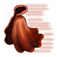
Here’s a recreation of the Cape of Velocity (made with MyPaint). I’ve tried to do it as close to the original as possible.
I’ve decided to go with 192x192, although the original image is bigger. I’ve also scaled it down to 45x45 to see how it would look in the Hero window.
The bigger version could be used for the artifact pick-up dialog window.
Feel free to tell me your opinions and suggestions.
![]()
![]()

Nice, I bet many people wouldn’t notice the difference 
It’s big enough for every use I can think of. As an icon, even quick painting looks just as good.
I don’t think that they have to be identical to H3 - some artistic imagination is always nice.
Why not? Check attachment and unpack it into Sprites directory.
Start the game (0.89 should work as well), find artifact (or place it in map editor), pick it up and look on new image 
All artifacts can be replaced in such way as long as you know artifact ID. You can find it for example in our item implementation list.
cape-of-velocity.zip (73.4 KB)
Thanks a lot for the remarks!
Well, maybe they don’t have to be identical, but I’m trying to keep the feeling of them intact so they can be recognized without (hopefully) reading their name. Of course, not all of them will look so close to the original. The original icons are so small that is very difficult to deduce all their features.
Thanks a lot for the hints on putting them into the game. I’ll try it to see exactly how it looks like.
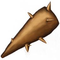
In the mean time, I’ve finished another one. This one you can definitely tell it’s different. I hope the change is in good, not in bad. 

![]()
![]()
Nice job on the artifact Icons. If it wasn’t for the description I would not be able to tell which one is the original 
Thanks a lot!
I have another one in the works. We’ll see how it turns out.
Nice work!
However, I think your club needs some details (dark lines), to make it closer to realistic style of HoMM3.
Thank you.
I know. For now, I’m trying to do “acceptable” versions of them. Later I can go back and fix the stuff I’m not happy with.
The ogre club of havoc should be “shaded” to look as if it has been longer beeing used.
Your version look as fairly new club compared to H3 havoked one 
On other side your cape of velocity is perfect 
I suppose it’s easier for you to do the complicated shapes than raw shapes which need have surface facture. But let try a bit and maybe the club is also able to you for perfecting…
Impressive job with the cape. Looks as good - if not better - than the original.
The club is promising as well, but I agree with the above that it’s missing some roughness (looks too polished for an ogre). And a detail, in case you’re gonna re-do it: the lowest spike on the club looks like it could hurt the one using the weapon, and I don’t see it on the original one (unless you have a higher res version of the original showing otherwise). You can even leave a mark as if it would have been a spike there, but broken by the owner, but I would remove the sharp end. IMO even the lower spike on the H3 version was too low to be practical, so I’d rather see an extra spike at the top of the weapon (which hits the enemy) than anywhere in the lower half, used for holding it. But that’s just MHO… I’m not the artist here, so you don’t have to change if you prefer it like this. 