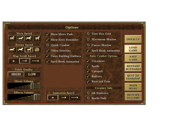
I suppose that traditional menu of Heroes 3 should be redone. It is quite strange actually, with unnecessary things at first sight and necessary things forgotten.
First, “Records” and “Credits” menu things are unneeded. This can be put to the corner with small icons, but usually noone gives a freak to it.
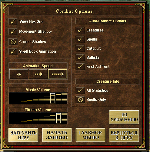
Second, Player needs whether single player stuff or multiplayer (to play hotseat) or load game, where everything is already configurated, just load and go. And then he needs options - its freaking strange that only way to setup options for game, for sound, for battle is to get to battle, to game. Why not setup everything at one place?
Third, everything else is quite traditional - single player is campaign, tutorial and scenario. I only added Duel mode to list - select faction, hero, setup level, buy units for certain sum and fight. Actually, quite good place to train AI. Or for fast hot seat… Multiplayer is about Duel and Scenario. That’s all.
Single Player
** Campaign
** Scenario
** Tutorial
** Duel
** Back
Multiplayer
**Hot Seat
**LAN
**WAN
Load Game
** Back
Options
**Video
**Audio
**Gameplay
Exit
Of course, this UI is outdated very much. So i consider, as all we need is graphics, then UI can be even made in Battle for Wesnoth style - native OS windows with some theme upgrade. And it’s quite obvious at large resolution screens, where UI is so small that requires glasses to watch this insect life. We need some scroll-down zoom-in for comfort play, I guess… And completely moddable inteface so it could be turn into something like H5 or H6 minimalism with only info required to play and grand map…
But not let’s talk of minimalism, if menu windows don’t use effectively their space. What if these were not windows but new fullscreen? So much space!
==========================================================
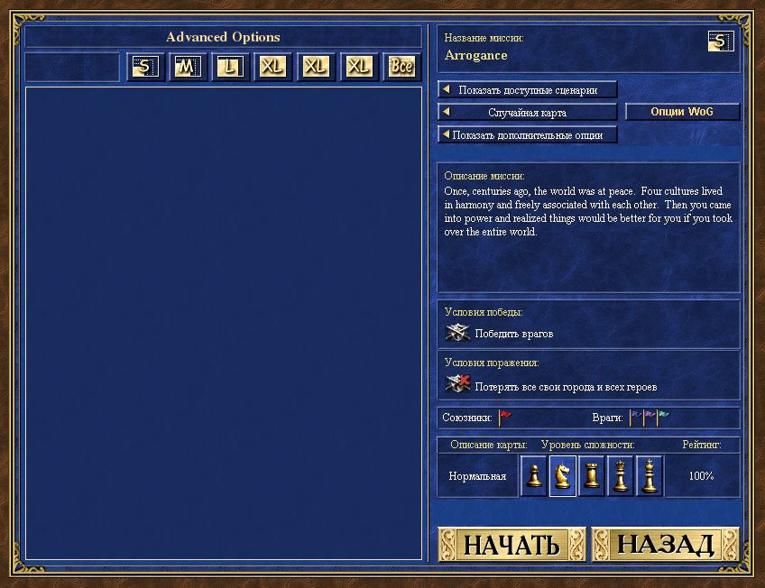
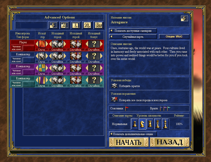
But I was trying to think of additional options for Heroes3. Like WoG. Actually, there is no need to create separate button for WoG options. Everything can be combined in one, with tabs:
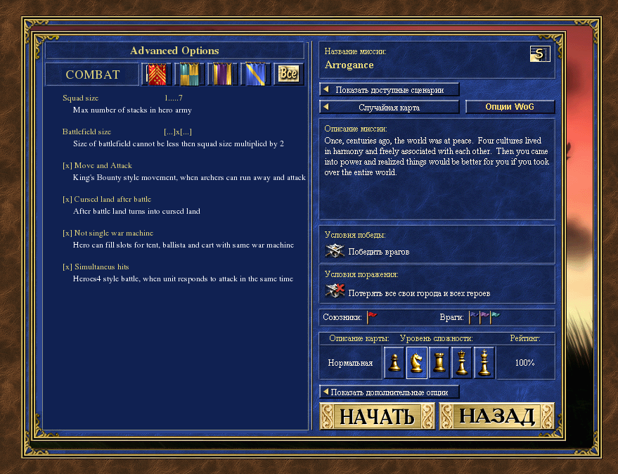
Click another tab - and you have such options:
So another things, that are like mutators, and that I suppose to get to main pack of VCMI options.
== Combat ==
- Squad size: 1…7 Max number of stacks in hero army
- Battlefield size: …]x…] Size of battlefield cannot be less then squad size multiplied by 2
- Move and Attack [x] King’s Bounty style movement, when your archers can run away and attack
- Cursed battle land [x] After battle land turns into cursed land
- Not single war machine [x] Hero can fill 3 slots for medicamp, ballista and cart with same war machine;
- Simultaneus hits [x] Heroes4 style battle, when unit responds to attack in the same time
== Economics ==
- Upkeep [x]
- Bank [x]
Both ideas should be thought well, in fact they are quite similar to market thing
== Skills ==
-
Open skill tree [x]
-
Necromancy disabled [x] Necromants have no superpower anymore.
** Necromancy unit type [x] Units turn to undead according to their level (every enemy dead stack gets its percent of undead)
** Necromancy global [x] Necromancers can’t get more units in a week, then percent of their weekly army income from all towns
** Necromancy growth [x] Instead of revival necromancy grants castle unit growth: Beginner: 1-3 (3-2-1); Advanced: 1-5 (5-4-3-2-1); Expert: 1-7 (7-6-5-4-3-2-1); -
Basic Tactics everyone [x] Heroes5 style: every hero has basic tactics ability as hidden skill
-
Faction Basic Skill [x] Heroes5 style: Necropolis - Necromancy; Castle - Leadership; other have to be invented;
== Commanders ==
- Commanders [x] Enable commanders
** Hero-commander [x] Hero is commander
** Magic spell at com turn [x] Cast spells only at commander turn. Force enabled when “hero-commander” option is enabled
** Commanders in army 1…7 Commando possible number in hero army
** Revive commanders [x] Commanders are ressurectable
** Commander squad [x] Commander gives bonuses to joined stack, and is revealed as last stack unit when stack is dead;
** Commander stack [x] Commander as separate stack;
** Battle death [x] In case of commander death battle lost;
** Battlefield artifacts [x] Potions, scrolls and other specials of commander are enabled
== Heroes ==
- Hero strike [x] Heroes 5&6 style. Attack based on commander stats. Disabled with “hero-commander”.
- Hero turn [x] Heroes 5 style. Magic spells or hero strike can be done only at abstract hero turn;
- Lost heroes [x] Heroes lost in battle cannot be bought in tavern by ex-master;
- Mortal heroes [x] Heroes lost in battle cannot be bought in tavern at all;
- Sudden death [x] In case of death of main hero, game ends;
- Only native heroes [x] Only 16 native heroes available
- Heroes w/o army [x] Heroes 4&6 style. Hero can travel w/o units. Automatic loss when attacked.
- Heroes max hired simult. 1…16 Maximum number of heroes can be hired at the moment
- Heroes max hired 1…0 Maximum number of heroes can be hired at all (from 1 to infinity)
- Hero starting level …] Starting level
- Hero max level …] Max level hero can achieve
== Army ==
- Army w/o heroes [x] Heroes4 style. Looks like usual hero but no hero there and his bonuses and experience
- Caravans [x] WoG, Heroes5 style. Automatic gathering from captured dwellings
- Set guardians [x] Set stack at any map place as guardian unit.
- Daily army [x] Heroes4 style. Buy your units daily, don’t wait week to end!
- No upgrades [x] Heroes2&4 style. Units are the way they are. Just buy and fight
** 2nd level creatures [x] Heroes2&4 style. Units are the way they are upgraded. Just buy and fight even more
== Map ==
- Fog of War [x] Heroes4, WoG style. Enable FoW in game
**Transparent FoW [x] Heroes4 style. Recoinassanced territory is visible but no updated actual info. If disabled, everything is like in veil of darkness mode. - No FoW at Start [x] If FoW is disabled, then game is like chess now. If transparent FoW is enabled then all map reveiled.
- Moving creatures [x] Heroes4 style. Units attack hero, if he has stopped too close;
- Dwellings w/o creatures: [x] Heroes6 style. Dwellings only increase town units to be hired.
- Rebuild dwellings [x] Heroes6 style. Dwellings can be rebuilt to the same level of your faction creatures.
== Towns ==
- All army bought at castle [x] Heroes6 style, should be calculated like hero has basic castle growth + unit dwelling growth + other town dwellings like global map growth;
- Castle control zone: 0…7 Heroes6 style. Number of abstract logistic units till the object on map (ALU - default hero movement w/o improvements; 0 - no territory control);
** Automatic gathering [x] Auto gathering from windmills etc from controlled territory - Town rebuilding [x] Heroes 6, WoG style. Player can rebuild any town to his race type;
- Building destruction [x] WoG style. Towns can be destroyed too…
** Destruction reward: 0…100% Player can get resources input into building.
** Destruction cost: 0…100% Player must pay to destroy building.
== Other ==
- Switch player to be first weekly [x] Make multiplayer more random and balanced.
- Player turn time 1…0 Turn time: from 1 minute to infinity.
Well, there could be little bit more rules, like removing certain skill, towns, spells or heroes from game, saving lists for future use. Or reverting back to H3/H4/H5/H6/H3Pro list options. Or else.
Heroes_improvements.txt (7.01 KB)
